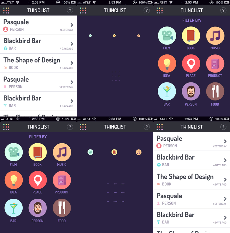
A trend I’m seeing for the coming year is the rise of Transitional Interfaces on the web. A fine example is the aforementioned Fluidbox, or this interface (extract from the post linked):

Sparked by the post linked — which you should read — I started goofing around with CSS transforms and transitions a bit. The result is something I call CSS Animated Content Switching, which you could use when switching content in tabs or something like that. A little demonstration is embedded in the pen below:
Panels can enter and exit using several animation classes I’ve prepared: a panel can slide in/out to a given direction (up/down/left/right), scale up/down, and/or fade in/out. Just define the animations to use on the wrapper using data-* attributes and you’re good to go:
<div class="panelWrapper" data-enter="slideright" data-exit="slideright">…</div>Animations can run in parallel, or sequential. Parallel is useful when the entering and exiting panel animate in the same direction (e.g. slide in and out to the right), resulting in one fluid animation. Sequential is useful when the entering and exiting animation are the opposite of eachother.
<div class="panelWrapper" data-enter="slideright" data-exit="slideleft" data-sequential="true">…</div>Above that some animations can be combined as they’re essentially classnames that are assigned. When scaling up/down it is suggested to also change the opacity along with that, using the predefined fade classname.
The clever aspect of the code is the animating classname: only when the wrapper element has that classname assigned will the CSS properties (transforms, opacity, etc.) of the children be transitioned from a starting position/state to an end position/state. This allows us to set starting positions without any transition, and then – once .animating is in place – transition to the end position.